

The Client
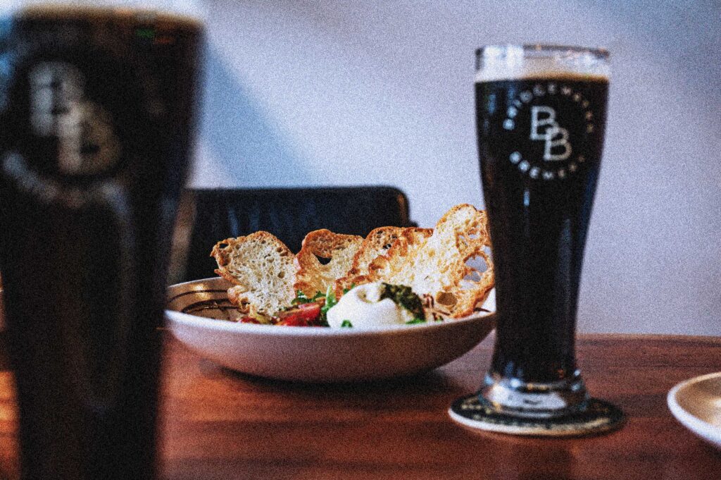
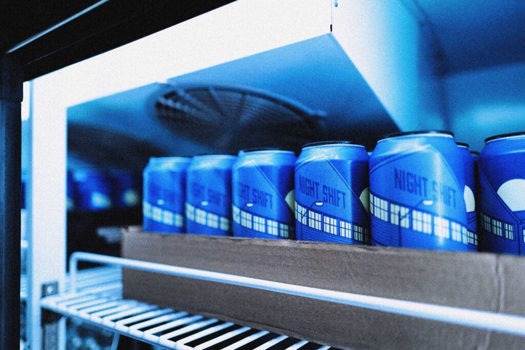
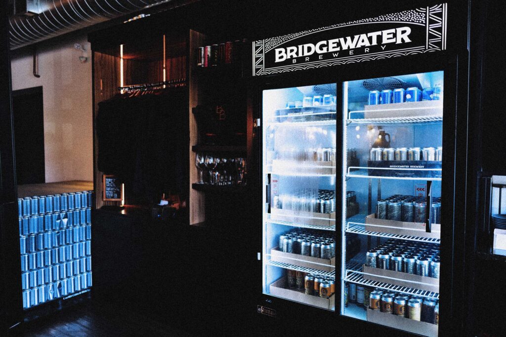
Bridgewater Brewery is a community-focused brewery and taproom located along the recreational canal in downtown Welland, Ontario. Brewing all their beer onsite, they offer a vibrant menu of craft beer, cocktails, wine, and creative food. Bridgewater is built around the spirit of connection, serving as a welcoming gathering place for locals and visitors across Niagara.
The Challenge
Our task was to develop a visual identity system that would position the brand as a premium establishment in the competitive craft beverage market, while creating an authentic connection with the local community and culture.
The system needed to design a visual language that would attract tourists while maintaining an inclusive atmosphere for locals, all while reflecting the brand’s commitment to quality craft beer, exceptional food, and superior customer experience.

Target Demographic
A major challenge is to create a brand that maintains premium quality and exceptional standards while remaining genuinely welcoming and inviting to all community members—helping to break down the perceived pretentiousness and stigma often associated with craft beer establishments. This requires thoughtful consideration of how to present an elevated experience that doesn’t alienate local residents or make them feel out of place.
Project Insights
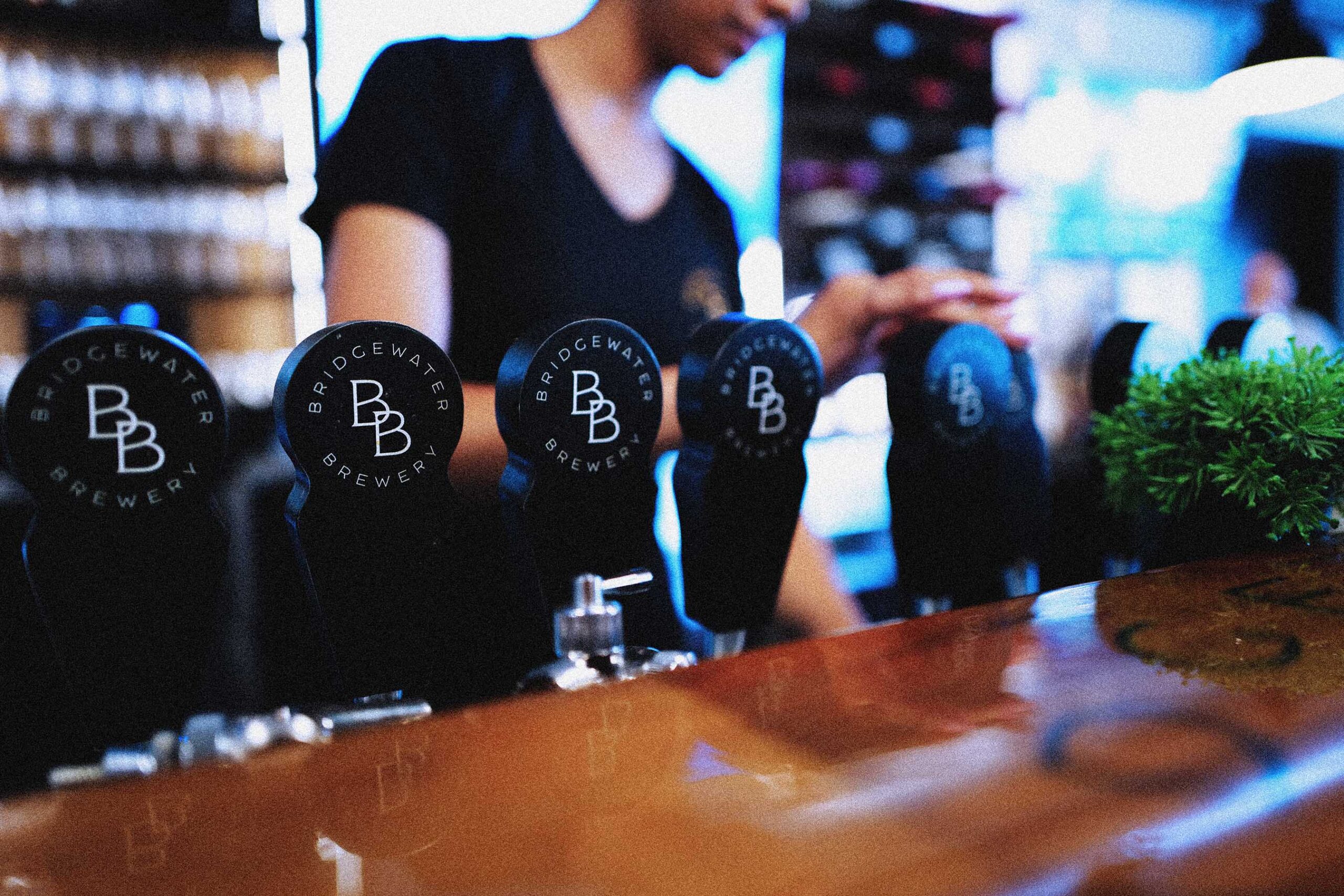
Unlike other establishments in the Niagara region, they uniquely bridged premium craft excellence with local authenticity, creating a modern-industrial space that feels like home while delivering exceptional beer, food, and community impact.
Their premium atmosphere and warm hospitality made them the destination where upscale meets casual, and where refined taste harmoniously blends with local charm.
The Outcome
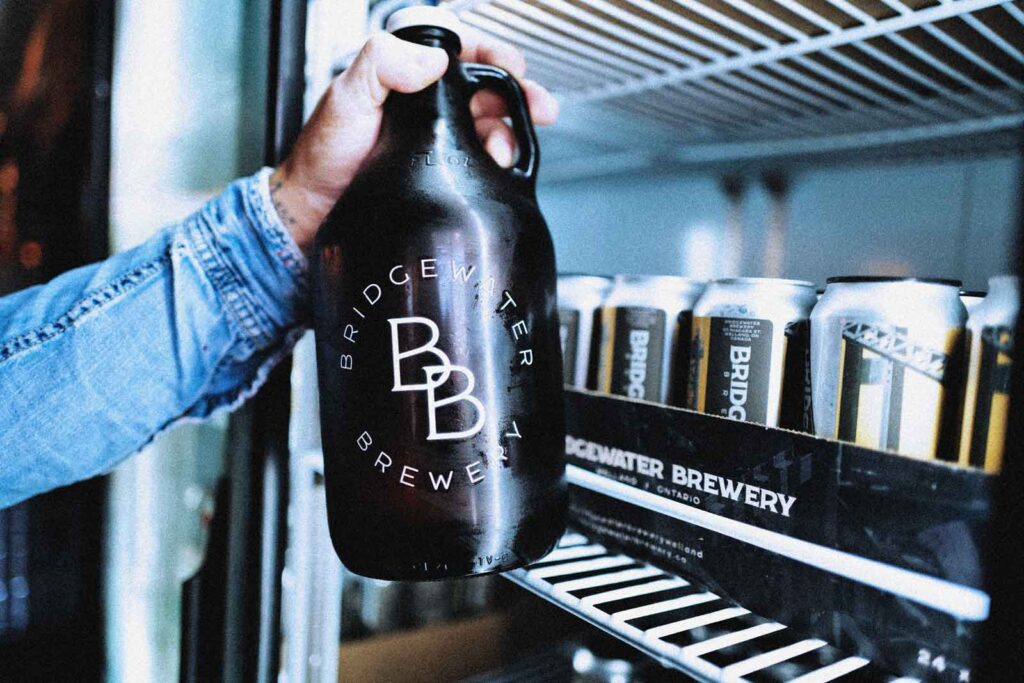
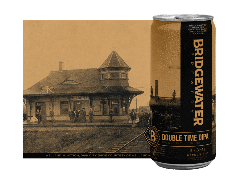
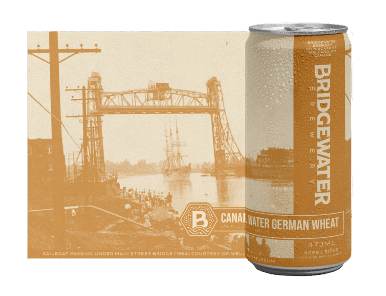
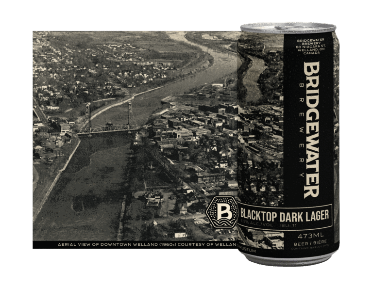
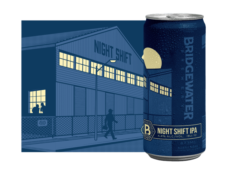
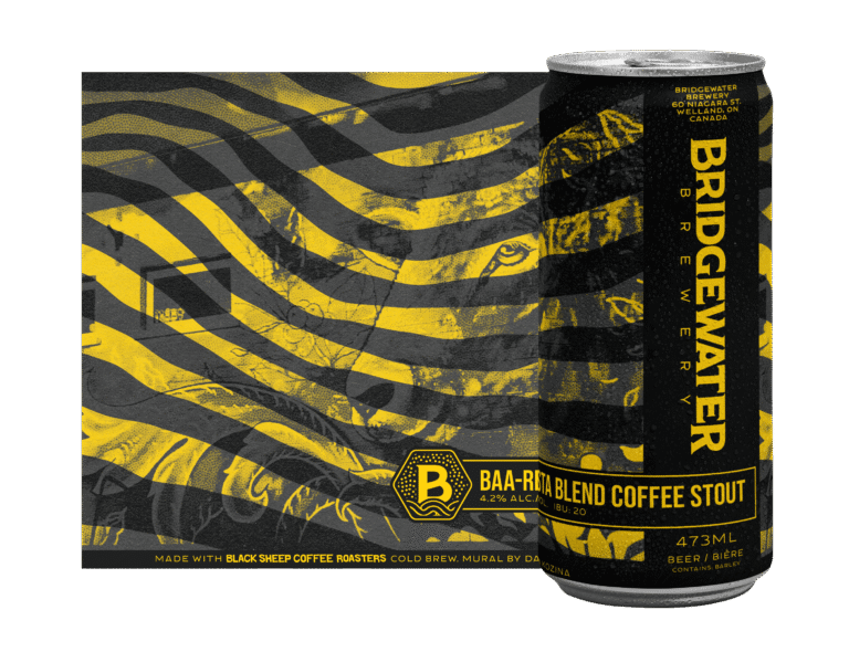
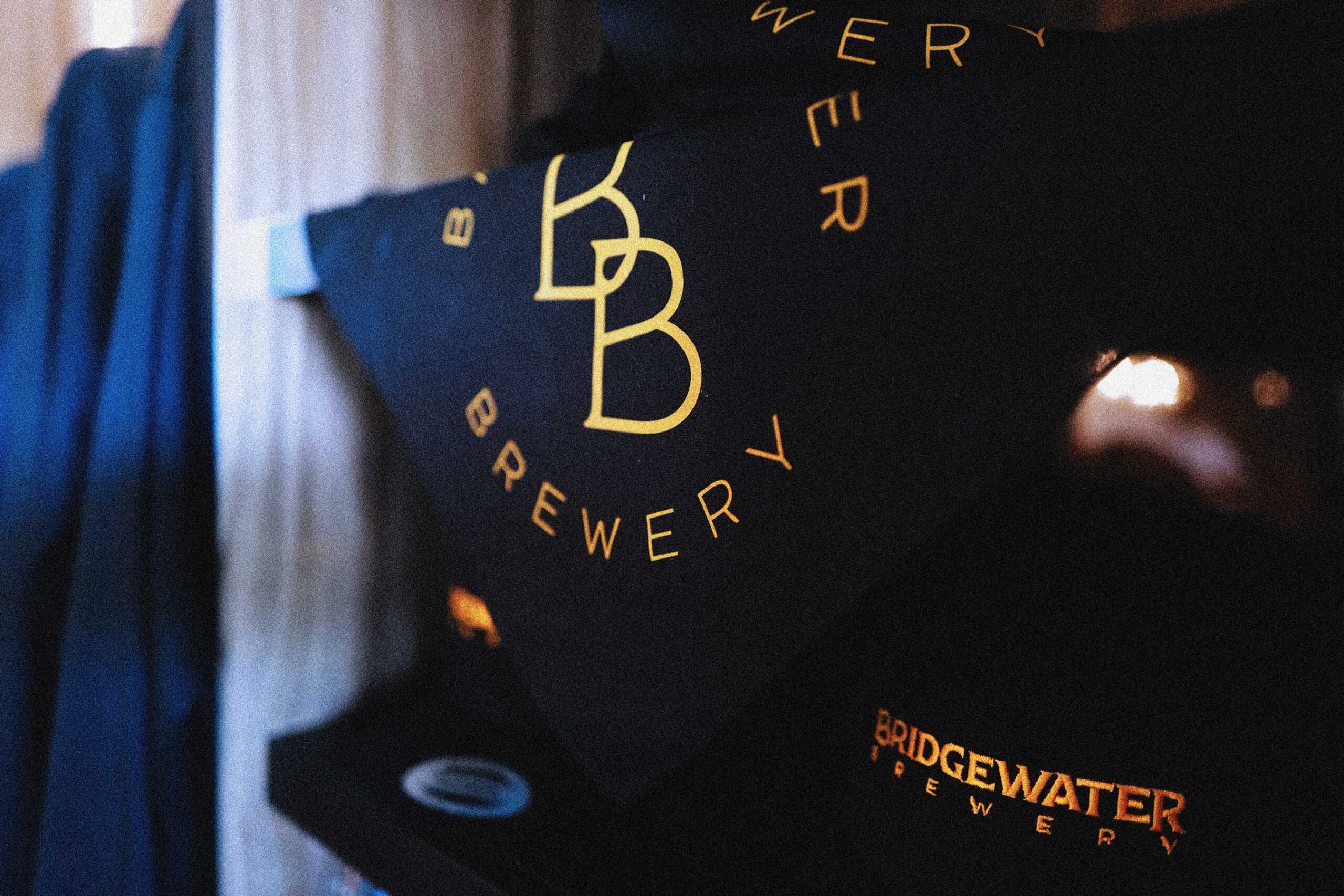
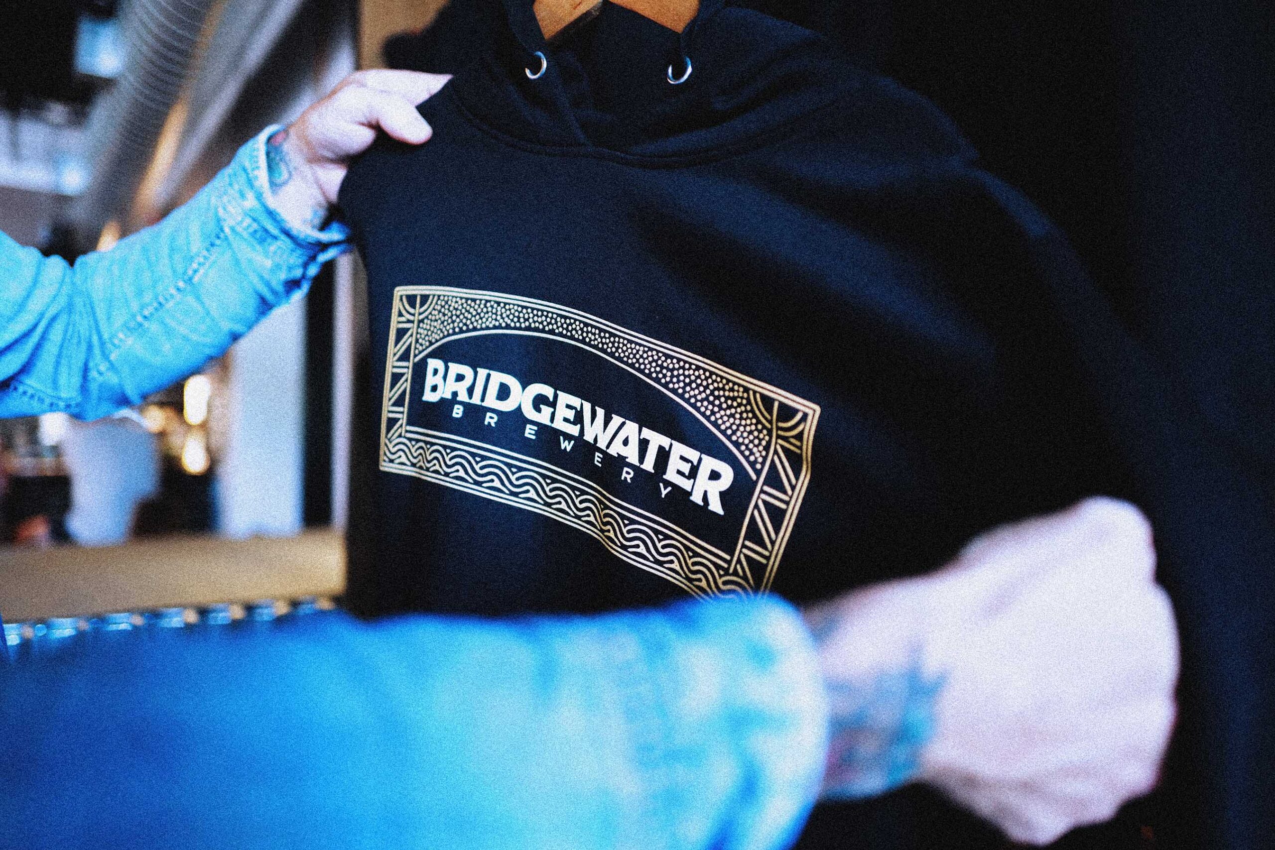
Through strategic design, we’ve created a high-end, timeless brand presence. The system balances modern industrial design with warm, inviting elements—making the brand both sophisticated and approachable. The brand maintains deep roots in the local community while delivering an elevated experience that feels authentic.
Our solution includes a cohesive suite of branded materials—from signage and packaging to digital presence—that establishes Bridgewater as a standout destination in the Niagara region. Most importantly, the new identity system successfully communicates Bridgewater’s commitment to craft excellence and positions it as a premium destination within the craft brewery/restaurant community


Proven Results
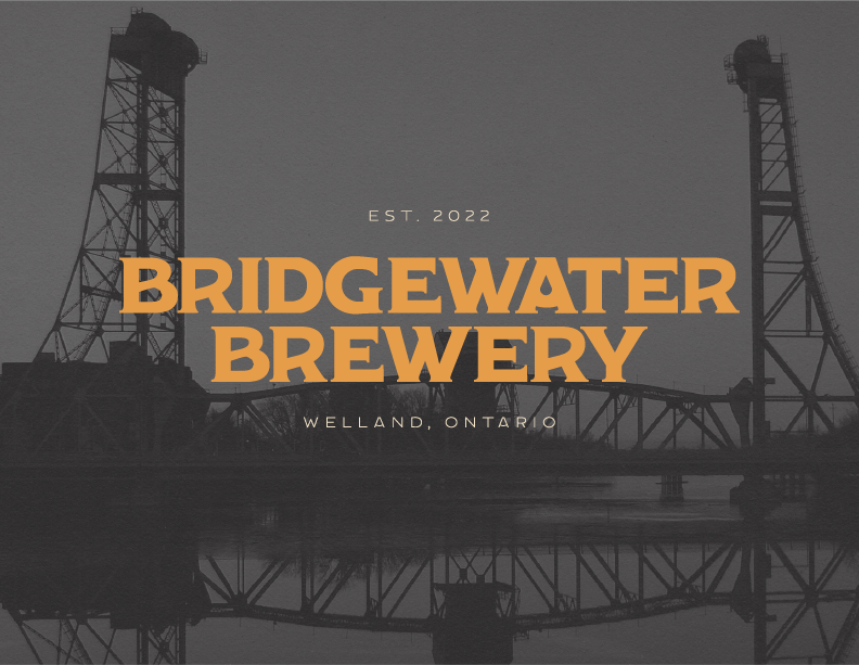
Typography
We selected typography that balances clean modernism with a subtle handcrafted touch, reinforcing the brewery’s blend of tradition and innovation. The primary fonts are approachable and highly legible, ensuring clear communication across digital and physical spaces. Secondary typefaces introduce a sense of character and creativity, supporting the brand’s artisanal focus without sacrificing clarity or accessibility.

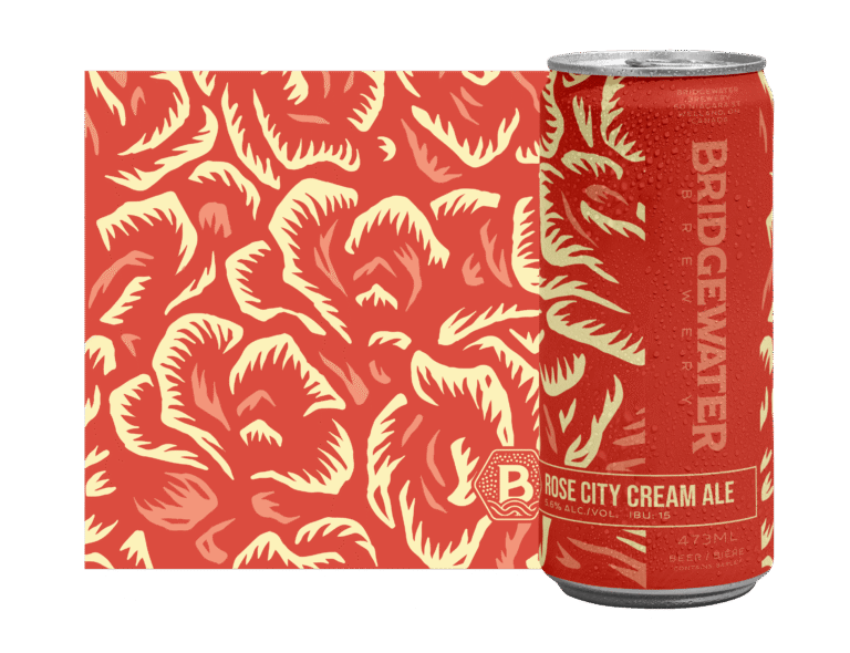
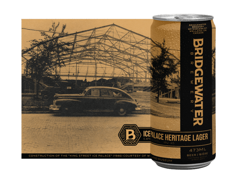
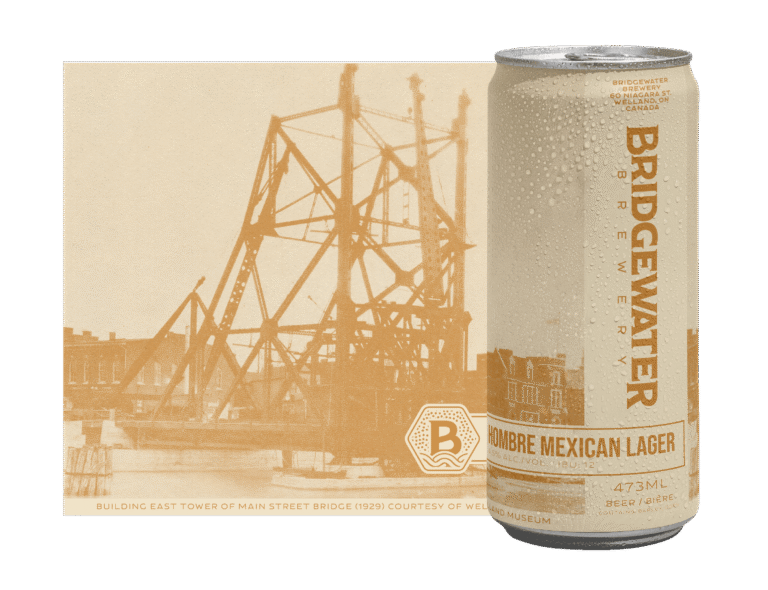
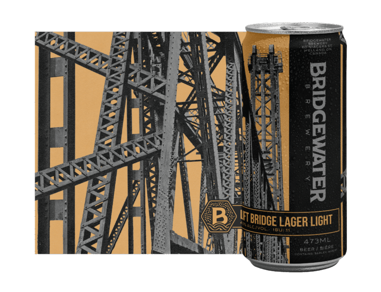
Colour
The color palette blends earthy warmth with fresh, inviting tones, creating an atmosphere that feels both lively and comfortable. Neutral beiges and richer accent colors add vibrancy without overwhelming the brand’s approachable spirit. The result is a palette that feels timeless, rooted in the local environment, and full of life.